Link to progress platform:
https://jetsonvillefont.blogspot.comBrief description of what I have assembled:
 |
| Jetsonville original design: Capital letters with width at 100% of height. |
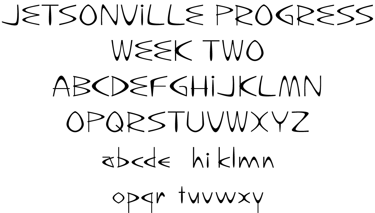 |
| Jetsonville Progress, Week Two: Capital letters with width at 80% of height. |
—The uppercase characters for the Jetsonville font have been re-proportioned and redrawn. (See the post below this one for details on why I felt this was necessary.)
—All but a few of the lowercase characters for the Jetsonville font have been drawn.
 |
| Preliminary (and very rough) sketches for Jetsonville type specimen images. |
—I have created some sketches for the type specimen images.
—I have added some more links to my research archive.
What’s working:
I think the uppercase and lowercase characters are working together reasonably well.What I feel still needs work:
—I have many more characters still to draw (numbers, punctuation, other miscellaneous characters).—Once all the characters are drawn, the outlines of the characters (and the spacing and kerning of the font) will need to be fine-tuned and harmonized. My weekly schedule calls for this to be done by Week 5, so I anticipate that the prototype due at the end of Week 3 will not be the completed font.