Tuesday, June 30, 2020

For Illustrator mavens: My blinding flash of the obvious


I am now at the point where I am ready to start creating accents and accented characters for Jetsonville. These characters are being created in Adobe Illustrator and then imported into FontSelf to create an actual OpenType-format font.

So far I have been building every character in its own Illustrator file and then importing the outline into FontSelf. I have already created several alternate characters, such as the o-e ligature, by duplicating the Illustrator file for lowercase o, opening the Illustrator file for lowercase e and copying the outline of the character, and then pasting the outline for the e into the duplicated file containing the lowercase o. After adjusting the two letter outlines so that they fit nicely, I saved the duplicated file with a new name and imported the o-e ligature into FontSelf.

Yesterday morning, as I contemplated starting to make the 56 accented uppercase and lowercase characters that the font needs, I had a “blinding flash of the obvious” concerning this process: There is no need to duplicate and rename all these files. I can simply add the accents to the existing letter files as new layers. Then I turn layers on and off to create the outlines I need and import the outlines into FontSelf.

Well, duh. Of course that would be simpler. This also means that if I fine-tune the outline of the base character, I only have to make the change once, and then turn layers on and off to import all the new character outlines into FontSelf. If I made the accented characters the way I was formerly planning to, I would have to open each file for each accented character and apply the same changes I applied to the base character. That would be a lot more work than using layers.

I could wonder why it took me so long to figure this out, but I would rather be grateful that I did figure it out before I started the process of creating all the accented characters.

Sunday, June 28, 2020

4.A New Component, First Pass

Well, this isn’t really a new component as such. As laid out in my project plan, this week’s posting is instead an extension and revision of last week’s Prototype posting. In last week’s Prototype posting I posted all of Jetsonville’s uppercase and lowercase letters, numbers, and some punctuation and other special characters.

For Week 4, I have added a bunch more special characters. I revised the lowercase “y”, and lowered the en bullet, based on feedback I received during Tuesday’s meeting. (Thank you!) I also printed out what I had, looked it over, and did some fine-tuning. The adjustments are subtle but, I think, worthwhile. You’ll be able to see the adjustment process and outcome if you scroll down a bit. But first, here is the current state of the Jetsonville font:

Jetsonville progress, Week 4

The above shows the font after many hours of proofing, analysis, adjustment, and fine-tuning. Here is how the characters looked at this start of this process:

Jetsonville version 0016 before adjustments

Here is a scan of the above with my marking showing what adjustments I thought needed to be made:

Jetsonville version 0016 with adjustments marked


And here is basically the same jumble of characters after adjustment:

Jetsonville version 0017 after adjustments have been made

Looking at the above, I think the adjustments I made definitely improved the font. I still see some things I’d like to fix, however. And I still need to create accents and accented characters, perhaps a few other special characters, and perhaps ligatures for ff, fi, fl, ffi, and ffl. And, of course, the JetBats special characters if there’s time.

Feedback request: How does anyone think the font is looking? What do you think works and what do you think could be improved?

I have also been thinking about the type specimen images that are due in Week 7 and the motion graphic that is due in Week 8. I played around this week with an idea for a type specimen using my keywords. I made what I thought was a nice hand-sketched start:

Jetsonville wk 4 specimen sketch
Jetsonville Wk 4 specimen sketch

Then I tried creating this type specimen in InDesign. Below is my fifth revision, which I am still not happy with:

Jetsonville wk 4 type specimen, fifth revision
Jetsonville Wk 4 type specimen, fifth revision

For one thing, the color palette isn’t working. At all. More work is needed in future weeks.

I also did some thinking about the motion graphic that I will create to show off the font. I came up with a script of sorts. The background will be the theme music to “The Jetsons” television show. Letters and characters will be zooming and dancing all over the screen, while a 1960s-type television announcer voice intones the following script. From the script, you can imagine what the visuals will be:

“Now, direct from the future to you—

“Jetsonville! The space-age font with the retro forward look!

“Jetsonville includes 26 sparkling uppercase characters . . .

“26 dazzling lowercase characters . . .

“10 shiny digits . . .

“A plethora of punctuation . . .

“And many other special characters!

“Use Jetsonville for that fun, space-age look!

“Use Jetsonville for communications in English, French, Spanish, German, and most other Latin-alphabet languages!

. . . and the sign-off:

“Jetsonville. Better living through typography.”

So that’s what I’ve been doing this week.

Another feedback request: Any suggestions on how to get the type specimen to work better? And does the script for the video seem like it will work? Thanks for any feedback anyone can offer.


Friday, June 19, 2020

Thoughts on the first draft of the Jetsonville font


Last night I posted the current state of the Jetsonville font. Uppercase characters, lowercase characters, numbers, many punctuation and other characters: complete. Well, not complete, but there. Existing. Something, anyway.

But what I posted is really a first draft, even though some of the characters have been through ten or fifteen revisions already. As I look at this first draft, with all of these characters together, next to each other, in one place, I see some work that needs to be done.

Just from casually looking at all the characters together, I see some differences between characters that need to be harmonized. Some uppercase characters, such as A, C, D and V, show considerable variation in stroke weight along the arch. The ends of the arch are thinner and the center of the arch is thicker. Other uppercase characters that are composed of two arches, like the B, E, M and W, do not show as much variation in stroke weight.

This inconsistency needs to be fixed. But how? Make the single-arch characters look like the double-arch characters, or vice versa?

My first thought is that I like the variations in the stroke weight. I think they are one of the things that give Jetsonville its unique character and feel.

So my first impulse is to try to introduce more variation in the stroke weight on the double-arch characters, and the other characters as well, to make them all harmonize with the current state of the single-arch characters.

I might try this and find that it does not work, in which case I will then try lessening the variation in stroke weight for the single-arch characters to make them more harmonious with the double-arch characters. I guess we’ll see what happens. I won’t know until I try.

It occurs to me that this process of designing letters using Adobe Illustrator has similarities to the process of sculpting in clay or marble (neither of which is in my skill set). The shape of a letter on the screen is infinitely plastic and malleable, and I can make it look any way I want by moving points and pulling Bezier handles. If, as the apocryphal story goes,  Michelangelo’s task in sculpting David was to chisel off all the marble that didn’t look like David, my task in creating Jetsonville is to move those points and pull those Bezier handles until the letters look like Jetsonville. 

Thursday, June 18, 2020

3.3 In Progress: Prototype + User/Target Audience Feedback


Jetsonville Progress Week 3

Here is the current state of the Jetsonville font—the Prototype—midway through Week 3 of this capstone project. We’ve got uppercase, we’ve got lowercase, we’ve got all ten digits, and a bunch of punctuation and other special characters.

Monotype’s recommended character set contains 186 characters. Shown above are 82 of them (if I am counting correctly). Only 104 characters to go!

So that’s what’s been done so far. 

Punch List


What remains to be done:

The rest of Week 3: Draw more characters.
Weeks 4 and 5: Fine-tune the character weight, spacing and kerning on the whole font.
Week 6: Finish type specimen still images.
Week 7: Finish type specimen motion graphic.
Week 8: Finish project web page.
Week 9: Prepare final presentation
Week 10: Make final presentation.

User/Target Audience Feedback:


This week I will be submitting the Jetsonville font in its current state to my subject matter expert and mentor, Chank Diesel. Next week I hope to report on his feedback.

Then, in a few weeks, I will ask several designers/art directors/font users for their feedback on the Jetsonville font and report their feedback here. 

Sunday, June 14, 2020

Wednesday, June 10, 2020

2.3 In Progress: Proof of Concept

Link to progress platform: 

https://jetsonvillefont.blogspot.com


Brief description of what I have assembled:

Jetsonville original design: Capital letters with width at 100% of height.


Jetsonville Progress, Week Two: Capital letters with width at 80% of height.

—The uppercase characters for the Jetsonville font have been re-proportioned and redrawn. (See the post below this one for details on why I felt this was necessary.)

—All but a few of the lowercase characters for the Jetsonville font have been drawn.

Preliminary (and very rough) sketches for Jetsonville type specimen images.

—I have created some sketches for the type specimen images.

—I have added some more links to my research archive.

What’s working:

I think the uppercase and lowercase characters are working together reasonably well.

What I feel still needs work:

—I have many more characters still to draw (numbers, punctuation, other miscellaneous characters).

—Once all the characters are drawn, the outlines of the characters (and the spacing and kerning of the font) will need to be fine-tuned and harmonized. My weekly schedule calls for this to be done by Week 5, so I anticipate that the prototype due at the end of Week 3 will not be the completed font.

Week 2: Miscellaneous meandering thoughts on my capstone project

Presented here are some recent thoughts about the development of the Jetsonville font, my capstone project for the Master of Arts in Graphic and Web Design (MAGWD) program at Minneapolis College of Art & Design (MCAD) in Minneapolis, Minnesota.

Some of these miscellaneous ramblings, in spruced-up form, may eventually find their way into the project’s website. But these thoughts will first be presented here in all their half-formed, off-the-cuff glory.

A warning about How the Sausage is Made

You know the old saying about eating sausage: Just enjoy the taste and don’t think too much about how it was made or what went into it.

The intention of this progress blog is to show how the sausage is made, or in this case how the font is made. I hope that, unlike sausage, knowing the design underpinnings of this font will make the reader appreciate the design of the font more—or at least won’t make the reader lose their appetite.

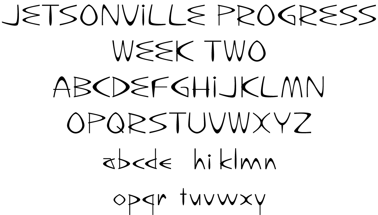
What I am striving for as I design the Jetsonville font: Uniform typographic color

The goal of font design, and the spacing and kerning that is part of that design process, is even or uniform typographic color. Kerning and spacing can accomplish a lot, but if a font is poorly designed, it’s hard for kerning to overcome that.

Even or uniform typographic color is defined as a lack of white holes or black spots— just a nice, uniform gray—when one looks at a block of type. Sometimes it helps to squint to see if the typographic color is even.

Gallery of Inspiration

The final website will probably contain a Gallery of inspiration. This gallery will show, among other things: the Theme building at LAX; the Gateway Arch in St. Louis; the Space Needle in Seattle; the TWA Terminal at JFK in New York; many buildings at the 1964-65 New York World‘s Fair; and examples of Googie coffeeshop architecture in Los Angeles.

Designing individual letters vs. designing a typeface, or Optics vs. Mathematical Precision

Jetsonville was originally designed around the concept of a parabolic arch, seen on the Jetsons television show and in many mid-century buildings like those shown in the gallery described above. But originally the parabola used to construct the letters of the Jetsonville font fit into a square: the arch was as wide as it was high. Different letters were created by rotating this parabola and adding other strokes. All the letters were basically square, and basically the same width.

This seemed to work fine where individual letters were concerned. I really rather liked the letterforms I was creating. However, once I started setting the letters next to each other, I saw problems with typographic color, as defined above.

The color of the type seemed to look better, and the letters seemed to sit next to each other more attractively, when I condensed the width of the capital letters to 80% of their height. But I did not want to just condense the letterforms, because that would alter and distort the stroke widths of the characters, and that would destroy the typographic color I wanted. Therefore, I decided to redraw all the capital letters.

Originally the lowercase letters were to have been the same width as the capitals, built from the same arch. When I tried doing this, however, that looked even worse than the square uppercase letters did. The lowercase letters seemed to look best at 70% the width of the capitals.

So, my original idea of “Wouldn’t it be great to use the exact same arch for all the letters,” while it would have been novel from a concept standpoint, turns out not to hold up in real life. In real life it’s better to use an arch that is taller that it is wide for letters where the arch is vertical (such as A and V), and it’s better to use an arch that’s wider than it is tall for letters where the arch is horizontal (like C and D). On the website I plan to show how and why it’s better to use these different arch proportions for the horizontal and vertical arches that are part of letterforms. In a nutshell: In font design, optical appearance wins over strict mathematics and novel concepts.

A bit about me and my typographic credentials

I am a “type guy.” I have been working with type, typography, and fonts since I was in high school. That’s a really long time.

I am in the final weeks of the Master of Arts in Graphic and Web Design (MAGWD) program at Minneapolis College of Art & Design in Minneapolis, Minnesota. I started the program in January of 2018. (Insert here a list the other classes I have completed in this program.)

I have worked in a lot of places that had Linotype and other typecasting machines, although I have never worked with them. My first job was at the local newspaper (the Chaska Herald in Chaska, Minnesota) running the newfangled Compugraphic 2961 phototypesetter.

Most of the rest of my phototypesetting career continued to be on Compugraphic equipment: the ACM9000 (8 fonts at a time, 12 sizes to choose from, very temperamental mechanically and electrically); the Unisetter (same basic idea but much improved); various versions of the Editwriter (basically a Unisetter with a keyboard and screen); and the 8600 and 8400, Compugraphic’s first digital typesetting machines. (The 8600 was Compugraphic’s first typesetter, and maybe THE first typesetter, to use fonts constructed with the now-ubiquitous Bezier curves.)

I later worked at shops that used Mergenthaler/Linotype typesetting equipment: the Mergenthaler 202 and the Linotronic 300 and 500. It was at that point in my career that Macintoshes, laser printers, and “desktop publishing” took over the industry; typesetting and keylining were consolidated into the singular task of page makeup; type shops basically disappeared; and phototypesetting morphed into imagesetting and platesetting, something that was handled by printers, not typesetters.

After the industry shift described above, I worked with Quark Xpress for many years until it was replaced by Adobe InDesign, which is the current state of the page-layout art, and its companions Adobe Illustrator and Photoshop.

I am proud that I have attained Journeyman status as a typographer/typesetter in two unions: Graphic Arts International Union (GAIU) Local #229 (later Graphic Communications International Union, or GCIU), and the International Typographical Union (ITU, now part of the Communication Workers of America or CWA).

Some things to ask my mentor, Chank Diesel, about


  • Font distribution
  • Legal considerations, copyright considerations, Jetsons name

Some other topics I could write about in this progress journal and include on the project’s website

—Choosing font-development software: I have decided to go with Fontself because, of all the font-development software packages I looked at, it has the lowest learning curve. Other font-development software has more capabilities but a higher learning curve. I still might decide to use some other font-development software in conjunction with FontSelf. (List other font-development software package under consideration, explain pros and cons)

—Describe further details of my personal history with fonts and typesetting technologies (strips of film and how they got damaged; width tapes; width plugs; what happens when you set type with the wrong widths; the coming of digital fonts; Penta, Bedford, Quadex, Magna, Ventura Publisher, and various other front-end typesetting systems and the dawn of the computerization of the graphics industry; early microcomputer typesetting systems pre-Macintosh)

—Show how each letter or character in Jetsonville was arrived at or evolved and from what (possible subject of motion graphic using morphing/tweening?)

—Discuss arches, especially the parabolic arches used in the architecture seen in “The Jetsons” and in other mid-century architecture

—Discuss the mathematics of arches and parabolas

—Discuss the engineering aspects of arches and parabolas

—Discuss “The Jetsons” television show (with links to a Smithsonian article about why the show is still relevant today)

—Discuss the mid-century, jet-age, space-age aesthetic as it applies to buildings, architecture, cars, consumer products, and furniture (as “hairpin legs” and in other ways, the arch turns up even in furniture of the period—the design of the arch connotes weightlessness). Even McDonald’s Golden Arches are from this time period.

—Maybe use Javascript to plot parabolas and even to create letters that could be the masters for font characters

—Discuss the use of a single arch line of varying thicknesses vs. a double arch line: one produces letter designs with non-weighted strokes while the other produces letter designs with weighted (thick and thin) strokes

—Detail the arch that is the starting point for both the uppercase and lowercase characters in Jetsonville. Show why and how the uppercase characters condensed 80% look better together than the squarer characters. Also show how the condensing was done so as to maintain the stroke weights. Describe further the importance of stroke weights to typographic color.

—In the future, maybe create an extended version of the Jetsonville font using the square (100%-width) letterforms

—Possible bonus (if there’s time): Jetsonbats or Jetbats. These could be alternate (dingbat) characters on the number keys or elsewhere:

  • Jetsons flying car
  • TWA terminal at JFK
  • Gateway Arch
  • General arch used to construct letterforms
  • Space Needle
  • Space platform under buildings in “The Jetsons”
  • LAX Theme Building
  • Rocket
  • Sputnik
  • Futuristic TV screen
  • Beanie with floating rings around antenna

—A sidebar called “Type Design Runs in My Family” about Ernst F. Detterer, an American type designer from the early to middle twentieth century who was my distant cousin.

Saturday, June 6, 2020

Link to Jetsonville Research Archive Listing

Here is a link to the Jetsonville Research Archive Listing document, where I will be collecting links to articles I use for the research needed for this project. There will be articles about the process and best practices of font development, font history, font marketing and distribution, font-development software tutorials—lots of interesting reading!